from IPython.display import Image
Image('../../Python_probability_statistics_machine_learning_2E.png',width=200)
The Bernoulli distribution we studied earlier answers the question of which of two outcomes ($Y \in \lbrace 0,1 \rbrace$) would be selected with probability, $p$.
We also know how to solve the corresponding likelihood function for the maximum likelihood estimate of $p$ given observations of the output, $\lbrace Y_i \rbrace_{i=1}^n$. However, now we want to include other factors in our estimate of $p$. For example, suppose we observe not just the outcomes, but a corresponding continuous variable, $x$. That is, the observed data is now $\lbrace (x_i,Y_i) \rbrace_{i=1}^n$ How can we incorporate $x$ into our estimation of $p$?
The most straightforward idea is to model $p= a x + b$ where $a,b$ are parameters of a fitted line. However, because $p$ is a probability with value bounded between zero and one, we need to wrap this estimate in another function that can map the entire real line into the $[0,1]$ interval. The logistic (a.k.a. sigmoid) function has this property,
Thus, the new parameterized estimate for $p$ is the following,
The logit function is defined as the following,
It has the important property of extracting the regression components from the probability estimator,
More continuous variables can be accommodated easily as
This can be further extended beyond the binary case to multiple target labels. The maximum likelihood estimate of this uses numerical optimization methods that are implemented in Scikit-learn.
Let's construct some data to see how this works. In the following, we assign class labels to a set of randomly scattered points in the two-dimensional plane,
%matplotlib inline

import numpy as np
from matplotlib.pylab import subplots
v = 0.9
@np.vectorize
def gen_y(x):
    if x<5: return np.random.choice([0,1],p=[v,1-v])
    else:   return np.random.choice([0,1],p=[1-v,v])

xi = np.sort(np.random.rand(500)*10)
yi = gen_y(xi)
Programming Tip.
The np.vectorize decorator used in the code above makes it easy to avoid
looping in code that uses Numpy arrays by embedding the looping semantics
inside of the so-decorated function. Note, however, that this does not
necessarily accelerate the wrapped function. It's mainly for convenience.
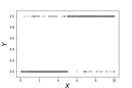
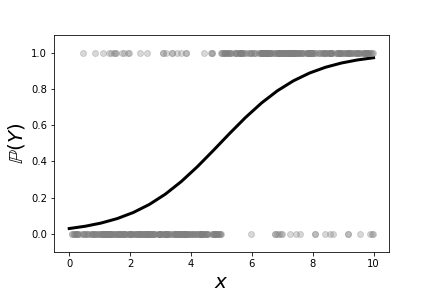
Figure shows a scatter plot of the data we constructed in the above code, $\lbrace (x_i,Y_i) \rbrace$. As constructed, it is more likely that large values of $x$ correspond to $Y=1$. On the other hand, values of $x \in [4,6]$ of either category are heavily overlapped. This means that $x$ is not a particularly strong indicator of $Y$ in this region. Figure shows the fitted logistic regression curve against the same data. The points along the curve are the probabilities that each point lies in either of the two categories. For large values of $x$ the curve is near one, meaning that the probability that the associated $Y$ value is equal to one. On the other extreme, small values of $x$ mean that this probability is close to zero. Because there are only two possible categories, this means that the probability of $Y=0$ is thereby higher. The region in the middle corresponding to the middle probabilities reflect the ambiguity between the two catagories because of the overlap in the data for this region. Thus, logistic regression cannot make a strong case for one category here. The following code fits the logistic regression model,
fig,ax=subplots()
_=ax.plot(xi,yi,'o',color='gray',alpha=.3)
_=ax.axis(ymax=1.1,ymin=-0.1)
_=ax.set_xlabel(r'$X$',fontsize=22)
_=ax.set_ylabel(r'$Y$',fontsize=22)
fig.savefig('fig-machine_learning/logreg_001.png')
from sklearn.linear_model import LogisticRegression
lr = LogisticRegression()
lr.fit(np.c_[xi],yi)
fig,ax=subplots()
xii=np.linspace(0,10,20)
_=ax.plot(xii,lr.predict_proba(np.c_[xii])[:,1],'k-',lw=3)
_=ax.plot(xi,yi,'o',color='gray',alpha=.3)
_=ax.axis(ymax=1.1,ymin=-0.1)
_=ax.set_xlabel(r'$x$',fontsize=20)
_=ax.set_ylabel(r'$\mathbb{P}(Y)$',fontsize=20)
fig.savefig('fig-machine_learning/logreg_002.png')
This scatterplot shows the binary $Y$ variables and the corresponding $x$ data for each category.
This shows the fitted logistic regression on the data shown in [Figure](#fig:logreg_001). The points along the curve are the probabilities that each point lies in either of the two categories.
For a deeper understanding of logistic regression, we need to alter our notation slightly and once again use our projection methods. More generally we can rewrite Equation (1) as the following,
where $\boldsymbol{\beta}, \mathbf{x}\in \mathbb{R}^n$. From our prior work on projection we know that the signed perpendicular distance between $\mathbf{x}$ and the linear boundary described by $\boldsymbol{\beta}$ is $\boldsymbol{\beta}^T \mathbf{x}/\Vert\boldsymbol{\beta}\Vert$. This means that the probability that is assigned to any point in $\mathbb{R}^n$ is a function of how close that point is to the linear boundary described by the following equation,
But there is something subtle hiding here. Note that for any $\alpha\in\mathbb{R}$,
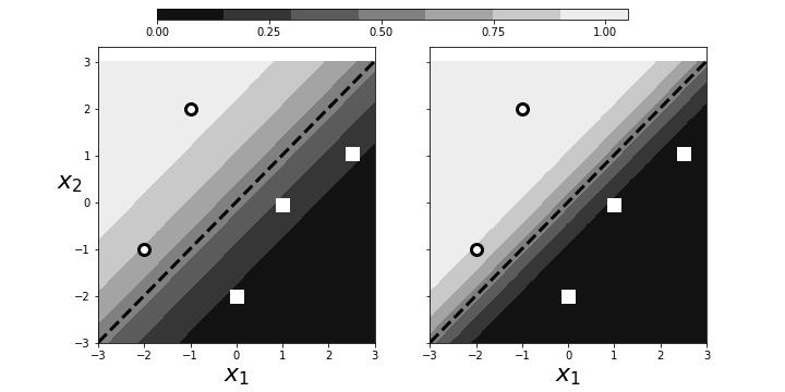
describes the same hyperplane. This means that we can multiply $\boldsymbol{\beta}$ by an arbitrary scalar and still get the same geometry. However, because of $\exp(-\alpha\boldsymbol{\beta}^T \mathbf{x})$ in Equation (2), this scaling determines the intensity of the probability attributed to $\mathbf{x}$. This is illustrated in Figure. The panel on the left shows two categories (squares/circles) split by the dotted line that is determined by $\boldsymbol{\beta}^T\mathbf{x}=0$. The background colors show the probabilities assigned to points in the plane. The right panel shows that by scaling with $\alpha$, we can increase the probabilities of class membership for the given points, given the exact same geometry. The points near the boundary have lower probabilities because they could easily be on the opposite side. However, by scaling by $\alpha$, we can raise those probabilities to any desired level at the cost of driving the points further from the boundary closer to one. Why is this a problem? By driving the probabilities arbitrarily using $\alpha$, we can overemphasize the training set at the cost of out-of-sample data. That is, we may wind up insisting on emphatic class membership of yet unseen points that are close to the boundary that otherwise would have more equivocal probabilities (say, near $1/2$). Once again, this is another manifestation of bias/variance trade-off.
Scaling can arbitrarily increase the probabilities of points near the decision boundary.
Regularization is a method that controls this effect by penalizing the size of $\beta$ as part of its solution. Algorithmically, logistic regression works by iteratively solving a sequence of weighted least squares problems. Regression adds a $\Vert\boldsymbol{\beta}\Vert/C$ term to the least squares error. To see this in action, let's create some data from a logistic regression and see if we can recover it using Scikit-learn. Let's start with a scatter of points in the two-dimensional plane,
x0,x1=np.random.rand(2,20)*6-3
X = np.c_[x0,x1,x1*0+1] # stack as columns
Note that X has a third column of all ones. This is a
trick to allow the corresponding line to be offset from the origin
in the two-dimensional plane. Next, we create a linear boundary
and assign the class probabilities according to proximity to the
boundary.
beta = np.array([1,-1,1]) # last coordinate for affine offset
prd = X.dot(beta)
probs = 1/(1+np.exp(-prd/np.linalg.norm(beta)))
c = (prd>0) # boolean array class labels
This establishes the training data. The next block creates the logistic regression object and fits the data.
lr = LogisticRegression()
_=lr.fit(X[:,:-1],c)
Note that we have to omit the third dimension because of
how Scikit-learn internally breaks down the components of the
boundary. The resulting code extracts the corresponding
$\boldsymbol{\beta}$ from the LogisticRegression object.
betah = np.r_[lr.coef_.flat,lr.intercept_]
Programming Tip.
The Numpy np.r_ object provides a quick way to stack Numpy
arrays horizontally instead of using np.hstack.
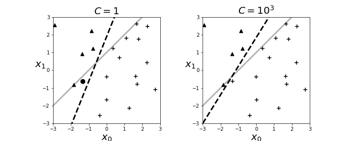
The resulting boundary is shown in the left panel in Figure. The crosses and triangles represent the two classes we created above, along with the separating gray line. The logistic regression fit produces the dotted black line. The dark circle is the point that logistic regression categorizes incorrectly. The regularization parameter is $C=1$ by default. Next, we can change the strength of the regularization parameter as in the following,
lr = LogisticRegression(C=1000)
and the re-fit the data to produce the right panel in Figure. By increasing the regularization parameter, we essentially nudged the fitting algorithm to believe the data more than the general model. That is, by doing this we accepted more variance in exchange for better bias.
The left panel shows the resulting boundary (dashed line) with $C=1$ as the regularization parameter. The right panel is for $C=1000$. The gray line is the boundary used to assign the class membership for the synthetic data. The dark circle is the point that logistic regression categorizes incorrectly.
Maximum Likelihood Estimation for Logistic Regression
Let us again consider the binary classification problem. We define $y_k = \mathbb{P}(C_1\vert \mathbf{x}_k)$, the conditional probability of the data as a member of given class. Our construction of this problem provides
where $\theta$ is the logistic function. Recall that there are only two classes for this problem. The data set looks like the following,
where $r_k\in \lbrace 0,1 \rbrace$. For example, we could have the following sequence of observed classes,
For this case the likelihood is then the following,
which we can rewrite as the following,
Recall that there are two mutually exhaustive classes. More generally, this can be written as the following,
Naturally, we want to compute the logarithm of this as the cross-entropy,
and then minimize this to find $\mathbf{w}$ and $w_0$. This is difficult to do with calculus because the derivatives have non-linear terms in them that are hard to solve for.
Multi-Class Logistic Regression Using Softmax
The logistic regression problem provides a solution for the probability between exactly two alternative classes. To extend to the multi-class problem, we need the softmax function. Consider the likelihood ratio between the $i^{th}$ class and the reference class, $\mathcal{C}_k$,
Taking the exponential of this and normalizing across all the classes gives the softmax function,
Note that $\sum_i y_i=1$. If the $\mathbf{w}_i^T \mathbf{x}$ term is larger than the others, after the exponentiation and normalization, it automatically suppresses the other $y_j \forall j \neq i$, which acts like the maximum function, except this function is differentiable, hence soft, as in softmax. While that is all straightforward, the trick is deriving the $\mathbf{w}_i$ vectors from the training data $\lbrace\mathbf{x}_i,y_i\rbrace$.
Once again, the launching point is the likelihood function. As with the two-class logistic regression problem, we have the likelihood as the following,
The log-likelihood of this is the same as the cross-entropy,
This is the error function we want to minimize. The computation works as before with logistic regression, except there are more derivatives to keep track of in this case.
Understanding Logistic Regression
To generalize this technique beyond logistic regression, we need to re-think the problem more abstractly as the data set $\lbrace x_i, y_i \rbrace$. We have the $y_i \in \lbrace 0,1 \rbrace$ data modeled as Bernoulli random variables. We also have the $x_i$ data associated with each $y_i$, but it is not clear how to exploit this association. What we would like is to construct $\mathbb{E}(Y|X)$ which we already know (see ch:prob) is the best MSE estimator. For this problem, we have
because only $Y=1$ is nonzero in the summation. Regardless, we don't have the conditional probabilities anyway. One way to look at logistic regression is as a way to build in the functional relationship between $y_i$ and $x_i$. The simplest thing we could do is approximate,
If this is the model, then the target would be the $y_i$ data. We can force the output of this linear regression into the interval $[0,1]$ by composing it with a sigmoidal function,
Then we have a new function $\theta(\eta(x))$ to match against $y_i$ using
This is a nice setup for an optimization problem. We could certainly
solve this numerically using scipy.optimize. Unfortunately, this would take
us into the black box of the optimization algorithm where we would lose all of
our intuitions and experience with linear regression. We can take the opposite
approach. Instead of trying to squash the output of the linear estimator into
the desired domain, we can map the $y_i$ data into the unbounded space of the
linear estimator. Thus, we define the inverse of the above $\theta$ function as
the link function.
This means that our approximation to the unknown conditional expectation is the following,
We cannot apply this directly to the $y_i$, so we compute the Taylor series expansion centered on $\mathbb{E}(Y|X)$, up to the linear term, to obtain the following,
Because we do not know the conditional expectation, we replaced these terms with our earlier $\theta(\eta(x))$ function. This new approximation defines our transformed data that we will use to feed the linear model. Note that the $\beta$ parameters are embedded in this transformation. The $(Y-\theta(\eta(x)))$ term acts as the usual additive noise term. Also,
The following code applies this transformation to the xi,yi data
import numpy as np
v = 0.9
@np.vectorize
def gen_y(x):
    if x<5: return np.random.choice([0,1],p=[v,1-v])
    else:   return np.random.choice([0,1],p=[1-v,v])

xi = np.sort(np.random.rand(500)*10)
yi = gen_y(xi)
b0, b1 = -2,0.5
g = lambda x: np.log(x/(1-x))
theta = lambda x: 1/(1+np.exp(-x))
eta = lambda x: b0 + b1*x
theta_ = theta(eta(xi))
z=eta(xi)+(yi-theta_)/(theta_*(1-theta_))
from matplotlib.pylab import subplots
fig,ax=subplots()
_=ax.plot(xi,z,'k.',alpha=.3)
_=ax2 = ax.twinx()
_=ax2.plot(xi,yi,'.r',alpha=.3)
_=ax2.set_ylabel('Y',fontsize=16,rotation=0,color='r')
_=ax2.spines['right'].set_color('red')
_=ax.set_xlabel('X',fontsize=16)
_=ax.set_ylabel('Z',fontsize=16,rotation=0)
_=ax2.tick_params(axis='y', colors='red')
fig.savefig('fig-machine_learning/glm_001.png')
The transformation underlying logistic regression.
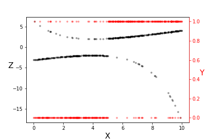
Note the two vertical scales shown in Figure. The red scale on the right is the $\lbrace 0,1 \rbrace$ domain of the $y_i$ data (red dots) and the left scale is transformed $z_i$ data (black dots). Note that the transformed data is more linear where the original data is less equivocal at the extremes. Also, this transformation used a specific pair of $\beta_i$ parameters. The idea is to iterate over this transformation and derive new $\beta_i$ parameters. With this approach, we have
Recall that, for this binary variable, we have
Thus,
from which we obtain
The important fact here is the variance is a function of the $X$
(i.e., heteroskedastic). As we discussed with Gauss-Markov, the appropriate
linear regression is weighted least-squares where the weights at each data
point are inversely proportional to the variance. This ensures that the
regression process accounts for this heteroskedasticity. Numpy has a weighted
least squares implemented in the polyfit function,
w=(theta_*(1-theta_))
p=np.polyfit(xi,z,1,w=np.sqrt(w))
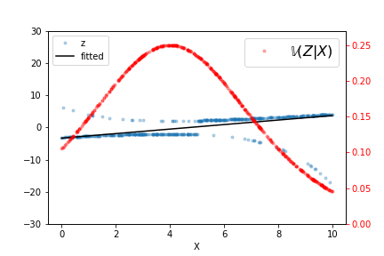
The output of this fit is shown in Figure, along with the raw data and $\mathbb{V}(Z|X)$ for this particular fitted $\beta_i$. Iterating a few more times refines the estimated line but it does not take many such iterations to converge. As indicated by the variance line, the fitted line favors the data at either extreme.
fig,ax=subplots()
ax2 = ax.twinx()
theta_ = theta(eta(xi))
_=ax.plot(xi,
        z,
        '.',alpha=.3,
        label='z'
       );
_=ax.axis(ymax=30,ymin=-30);
_=ax2.plot(xi,theta_*(1-theta_),'.r',alpha=.3,label='$\mathbb{V}(Z|X)$');
_=ax2.axis(ymax=0.27,ymin=0);
p=np.polyfit(xi,z,1,w=np.sqrt(w));
_=ax.plot(xi,np.polyval(p,xi),'k',label='fitted');
_=ax2.legend(fontsize=16);
_=ax.legend(loc=2);
_=ax.set_xlabel('X');
_=ax2.tick_params(axis='y', colors='red');
fig.savefig('fig-machine_learning/glm_002.png');
The output of the weighted least squares fit is shown, along with the raw data and $\mathbb{V}(Z|X)$.
